


App design can be evaluated on various merits: ease of use, brand adherence, even simple attractiveness. What often gets ignored is the platform consistency — iOS designs being ported to Android with zero changes.
It usually happens through no malicious intent. Designers are known to favour iPhones as their personal devices, leaving them with no visibility into what Android users want. Hence, here goes a brief — and by no means exhaustive — line-up of things to consider when designing for Android.
Think of it this way: even Android engineers can’t recognise every device that your app runs on. All phones have a screen, which has a specific size and density. That’s all you need to know. What is the aspect ratio? Is it even rectangular or square? Irrelevant.
Accommodating device variety boils down to ditching the “absolute” pixel-perfect mockups for the “relative” approach. Instead of meticulously defining the coordinates for every last element, think about what it should be aligned with and describe that relationship. Eventually, your layout will scale on any size screen.
You may (incorrectly) assume that the action bar is the same as the navigation bar on iOS. Sure, they’re both similarly positioned, but the differences go deeper than the title alignment. The action bar focuses on actions, not navigation.
One or two pivotal actions are shown as icons; others get compacted into the text-only overflow menu. Choose the actions that deserve icons carefully — they are designed to draw the user’s attention, so mundane ones (like settings) are best kept in the overflow. In fact, having only one action doesn’t necessarily mean that it should be an icon.

Users already know what common icons represent — use that knowledge! Only introduce an unfamiliar icon when it is rewarded with a new feature, and, by the same token, avoiding giving new meanings to standard icons.
As a rule, check the material icon pack first and if nothing suits, design a new icon. Be careful with subtle differences in similar icons: pin and folded map icons may both suggest “location”, but while the former refers to a specific place, the latter alludes to a browsable map.

Not being confined to a rounded square container, launcher icons enjoy more freedom on Android. You should take advantage of this freedom. Avoid emulating the same boxy icon your iOS app has and design something with a recognisable silhouette. Together with material effects, this makes it more tactile and inviting to press. Android users around you are the best test targets for that — hand them a device loaded up with a few different icons and see which one they tap.

Lists are meant to be informative and functional, so make them as light and airy as possible. Maintain full width, keep the separators thin, favour internal padding over external margins and, when items are clickable, always have a plan for the pressed state. Long-pressing an item reveals actions available for that entry in the action bar.
When list items are dominated by images, such as thumbnails or logos, the recommended approach is using a card view instead of an ordinary list.
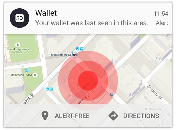
Android arguably invented notifications in their modern form and has come a long way since the simple title-and-message variety. Nowadays notifications can contain images, text, actions or even media controls, and when used correctly they can improve the experience significantly. Like with anything else though, overusing them will have the opposite effect.
Download size for an app matters and minimising the number of bundled images is a good way to optimise it. Avoid including basic shapes and text in your assets; describe the intended result to the engineers and they can be drawn programmatically. Similarly, when a plain icon is tinted to indicate different states, you should only provide that icon in black along with the colour codes for the overlay — everything else should be done in code.

Most Android users made a conscious choice to use the platform, likely because they enjoy how it works and looks. Hence, you can either score easy points by providing them with a familiar interface they love, or force a foreign concept of beauty onto them, causing a revolt in your review section. Simple choice, really.